

The Network That Mapped My Life
How I turned 2,236 LinkedIn connections, several weeks of manual tagging, and a collaboration with Claude into the most personal dataviz I've ever made

The lunch
It was October 2025, about a month after I lost my job at Yahoo Finance. Jason Forrest — dataviz practitioner, musician, and now chair of the new MPS in Data Visualization at SVA — took me to lunch. We’d met the year before through Flourish, who correctly intuited that two music-making chart guys would hit it off. The lunch was partly social, partly the kind of conversation you have when someone you respect wants to check in after something hard.
His advice was simple: build things. Personal projects. Stuff that’s yours.
I took that seriously. My first build was the NYC pizza viz — a collaboration with Anne Kadet of Café Anne, who had the data and the story. That took me through the end of 2025. Good work, satisfying, but still someone else’s idea at the core.
The LinkedIn project came later, and from a completely different direction.
April 1st
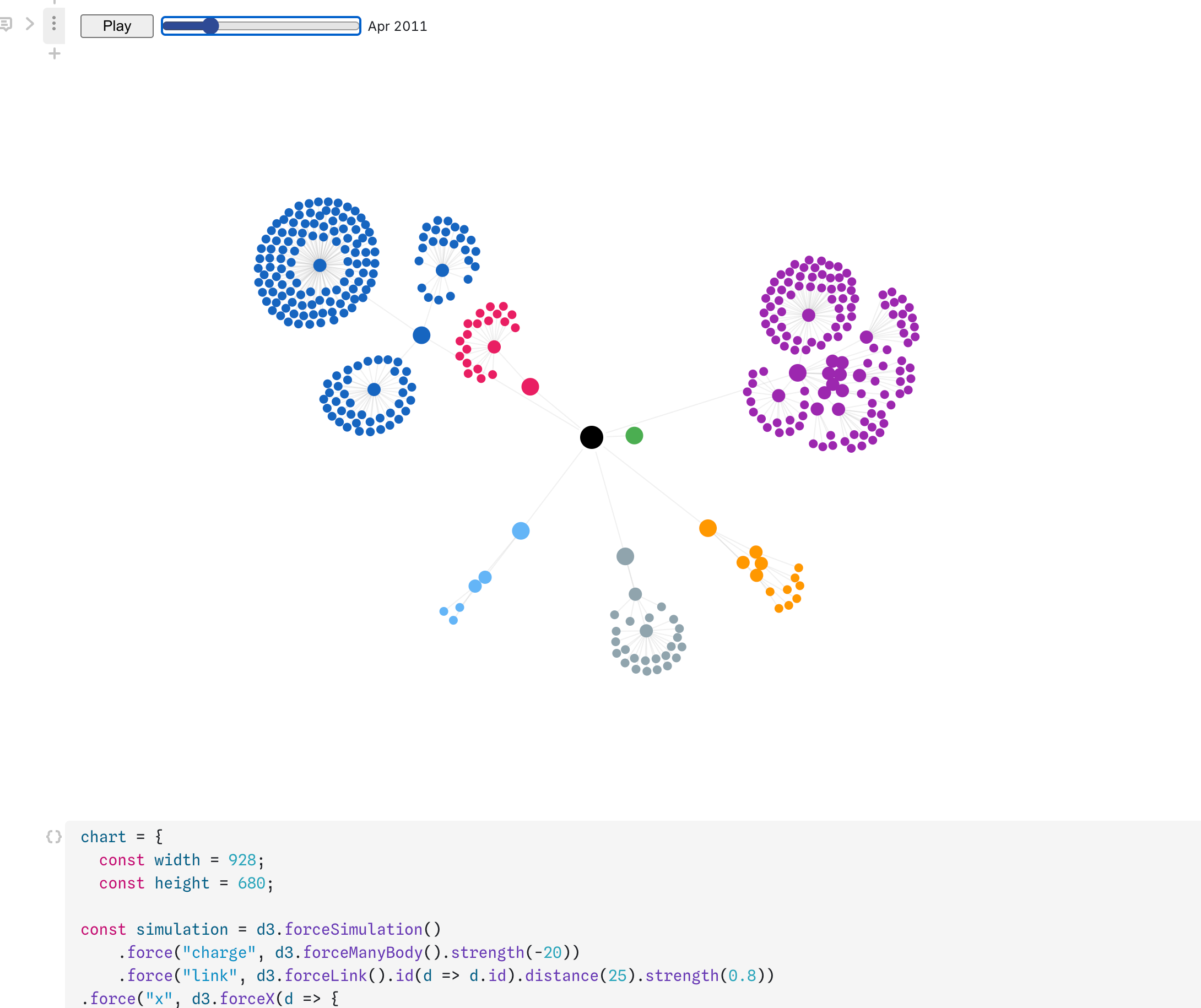
Apple’s 50th anniversary was April 1st, 2026. I’d been thinking about writing something to mark it — specifically about the Apple org chart I’d built for Fortune in 2011, the radial diagram that showed Steve Jobs at the center of everything. Adam Lashinsky later called it “the single biggest contribution to the seminal work I did on Apple.” It felt like a story worth telling.
To tell it properly, I decided to finally launch a Substack. And to build it the way I wanted — with real production support, sharp copy editing, coding help when I needed it — I pulled the trigger on a Claude subscription.
That first week, somewhere between drafting the Apple piece and figuring out what Chartwork was going to be, I asked Claude a throwaway question: how easy would it be to pull my LinkedIn connections data and do something visual with it?
Turns out, pretty easy. And the idea that had been sitting on the back burner finally had a shape.
The data problem
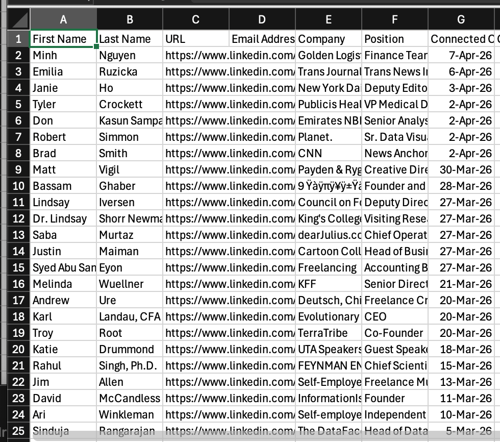
LinkedIn lets you export your connections as a CSV. What comes back is surprisingly sparse: First Name, Last Name, URL, Email Address, Company, Position, Connected On. That’s it.
The Company field is the critical limitation — and the critical insight. It shows where someone works now, not where you met them. My former BusinessWeek colleagues list their current employers. My Vindico connections from the ad tech years show up at whatever agency they moved to in 2019. The data tells you who’s in your network. It doesn’t tell you why.
Which meant the interesting question — how do I know these 2,236 people — was going to require human memory. Mine.
There were also 65 completely empty rows. Ghost accounts. People who’d deleted their LinkedIn profiles entirely. No names, no URLs, nothing. You can’t mourn what you can’t identify.
The taxonomy
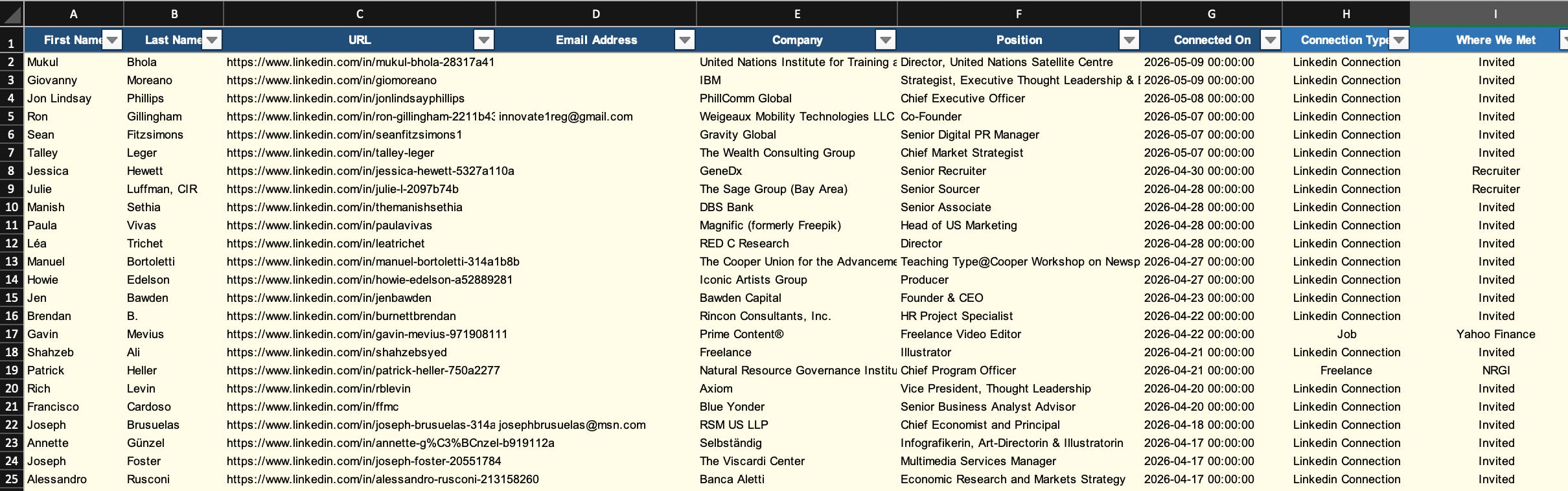
Before I could tag anything, I needed categories. Two columns emerged pretty naturally:
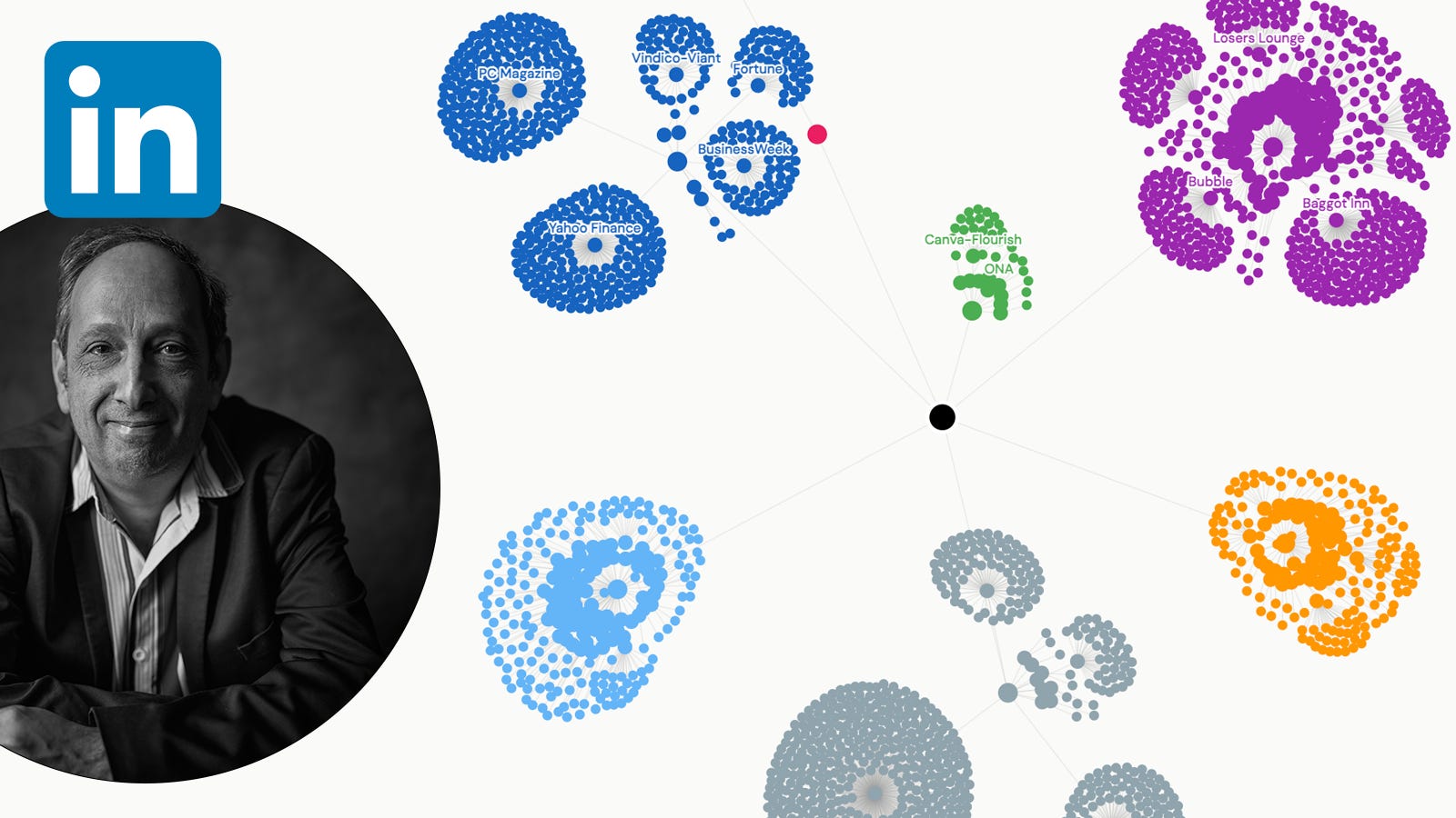
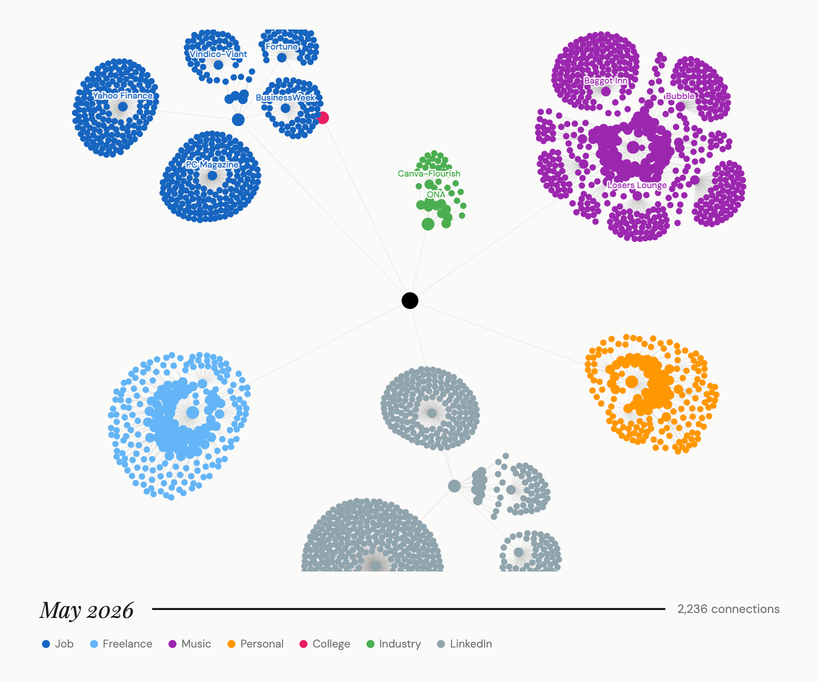
Connection Type — the broad relationship: Job, Music, Freelance, Personal, College, Conference/Industry, LinkedIn Connection.
Where We Met — the specific origin: PC Magazine, Yahoo Finance, Baggot Inn, Losers Lounge, Bubble, SUNY Purchase, ONA, Canva/Flourish... eventually 234 distinct values.
The two-field structure turned out to be the core insight of the whole project. Connection Type is the filing system. Where We Met is the memory. LinkedIn only ever asked “do you know this person?” — a binary yes/no. Adding these two fields asks the question they forgot: how?
The edge cases were instructive. A career coach I received through my Yahoo Finance severance package — Job/Yahoo Finance, not the vendor’s name, because YF is the real origin story. And then there were a few rows I simply tagged LinkedIn Connection and moved on, because the spreadsheet doesn’t need to know everything.
The tagging odyssey
Several weeks. 2,236 rows. Cross-referencing old emails, checking profiles, jogging memories I hadn’t touched in fifteen years.
I should mention the context. A close friend and fellow musician had died, and we were in the middle of planning his memorial. The week I did the deepest stretch of tagging, I’d walked through the venue for his service. I was thinking about the 1990s, about people’s kids who were babies then and are adults now, about how much time had passed. Scrolling through 2,236 names while thinking about mortality is not something I’d recommend as a casual afternoon activity. But it was honest. The data is a life. That’s what made it worth doing.
The small world moments kept coming. Someone I’d thought of as a LinkedIn connection turned out — when I searched my old email — to have organized a Data Viz meetup I’d attended in 2017, right across the street from my apartment. A Yahoo Finance colleague had invited me on LinkedIn and I’d nearly filed him as a generic connection until I pulled up his profile and remembered him properly. The tagging process was, unexpectedly, the most rewarding part of the whole project. A reminder of the remarkable people I’ve worked with. And a quiet sadness that so many of those regular freelance relationships have simply... vaporized.
Building it with Claude
Here is where I try to be honest about something the dataviz community is going to have opinions about.
I built this visualization in collaboration with Claude. Not “I used AI to generate a chart” — something more specific and more interesting than that.
I’d been using ChatGPT and Gemini for various things over the past year. When I switched to Claude in April, something clicked differently. The reasoning was sharper, the coding more reliable, and — crucially for a project like this — the collaborative back-and-forth felt more like working with a person than querying a tool.
The division of labor was clear from the start. I picked D3 and Observable as the right approach for a temporal force-directed network graph. I defined the visual language — seven connection types, seven colors, the logic that blue should be professional and warm tones should be personal. I decided the viz should animate forward through time, because the story is time. I wrote every word of the scrollytelling narrative. I did the tagging. I did the living.
Claude handled the code. When the simulation threw node not found: hub_Conference/Industry_Canva/Flourish — a crash caused by slashes in node IDs that D3 couldn’t parse — Claude diagnosed it, regenerated the JSON with sanitized IDs, and explained what had gone wrong. When the force layout was sending clusters off-canvas, we iterated through the physics parameters together: charge strength, link distance, gravity wells for each connection type. When the mobile layout broke the scrollytelling interaction, Claude fixed the CSS and adjusted the scroll trigger offset.
None of that is creative work. All of it would have stopped the project.
What I keep coming back to is this: the barrier between “I have an idea” and “the idea exists in the world” has always been execution. For a designer with deep editorial instincts and limited appetite for JavaScript debugging at midnight, that barrier was real. A force-directed D3 network with scrollytelling would have taken months to build alone, if I built it at all. With Claude as a collaborator, it took a few weeks — with most of that time spent on the genuinely interesting parts: the tagging, the writing, the editorial decisions about what the story actually was.
The creative judgment still lives entirely with the human. What changed is that the human doesn’t have to fight the syntax to get there.
I think this points somewhere genuinely exciting for dataviz journalism. Not “AI makes the charts now” — but something more like: the toolkit just got a lot larger for people who have something to say and know how to say it.
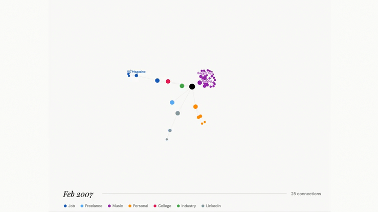
What the data actually showed
Music and Job are essentially tied — 519 music connections versus 535 job connections. I’d spent 30 years thinking of my music life as the parallel thing, the side project. The data disagrees. Baggot Inn alone — the venue I booked from 2002 to 2008, where I put Regina Spektor and Chris Thile on stage before most people knew their names — generated 150 connections. That’s larger than my entire Fortune or Vindico networks.
The 2011 spike is visceral in the animation. 438 connections in a single year — the year I pivoted from journalism to ad tech, turned down the Wall Street Journal, and started at Vindico. On the viz, that year looks like a detonation.
The LinkedIn Connection surge after my September 2025 layoff is the most recent story the data tells. Watch the gray cluster in the lower center of the final frame. That’s the network mobilizing. Recruiters, former colleagues, strangers who know the work.
The shape of things
The piece is live now at viz.davidfostergraphics.com/linkedin-network.
What I found, after all of it, is that 30 years of a career looks like this: two equally large worlds orbiting a single center. Blue for the journalism and data visualization that paid the rent. Purple for the music that kept me sane. Gray for the digital strangers who showed up after every layoff. Green for the industry that finally started paying attention.
At a certain point in life, you start wanting to see the shape of things.
This is mine.
Chartwork is a weekly behind-the-scenes look at data visualization and visual journalism. If this resonated, share it with someone who makes charts for a living — or someone who’s been meaning to map their own network.