

It Started as Two Charts. Then Things Got Interesting.
The behind-the-scenes story of The Growing Prosperity Gap — a collaboration with Rick Newman, a sketch that got ambitious, and what D3 + Scrollama + Svelte actually looks like in practice


The pitch
Rick Newman and I have been working together in some capacity since 2017, back when I was freelancing between news and finance before joining Yahoo Finance as staff. He covers economics — his Substack, The Pinpoint Press, is sharp, well-sourced, and has the loyal readership you’d expect from someone who spent years explaining markets to real people. At Yahoo Finance we’d already done a few Flourish-based scrollytelling pieces together, so when we both landed on Substack we picked up right where we left off.
Rick had been saying for a while that the Federal Reserve’s wealth distribution data would make a great time-based sequence. That idea sat on the back burner for a bit while I was heads-down on my first D3 + Scrollama build — the LinkedIn network viz. In the meantime, Rick and I made two static Flourish charts for one of his Substack columns: clean line charts showing the wealth gap over time, cut by income level and by wealth level. They were good charts. They got shared. But as soon as they were done, it was obvious we’d only shown one dimension. Rick had a lot more data and more ways to slice it — wealth flows by demographic, by age group, by asset class. There was so much more story sitting right there.
By then I’d just shipped the LinkedIn piece, and Rick was pretty impressed and game to go further. The new project would piggyback off that D3 + Scrollama foundation — with one addition to the stack: Svelte.
The sketch
Before writing a line of D3, we blocked out the sequence. We wired up a rough narrative structure in HTML — React charts as placeholders, static layout, just enough to pressure-test the order of panels and the editorial logic. That file is screenshot here if you want to see what “pre-production” looks like for a project like this.
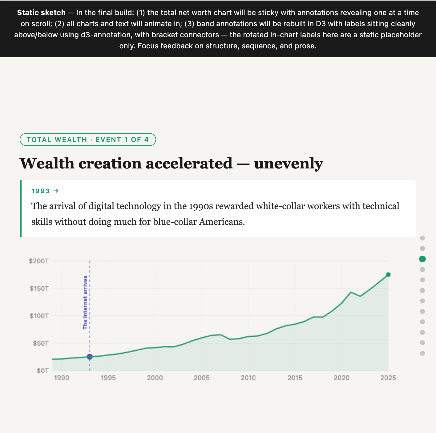
The sketch locked in two things that carried straight through to the final build. First, the narrative arc: start with the aggregate picture (total household net worth, 1989–2025), then zoom in on the two biggest asset classes — stocks, then real estate — and show who’s captured the gains in each. The sequence builds from “America got a lot richer” to “here is exactly who captured that wealth.”
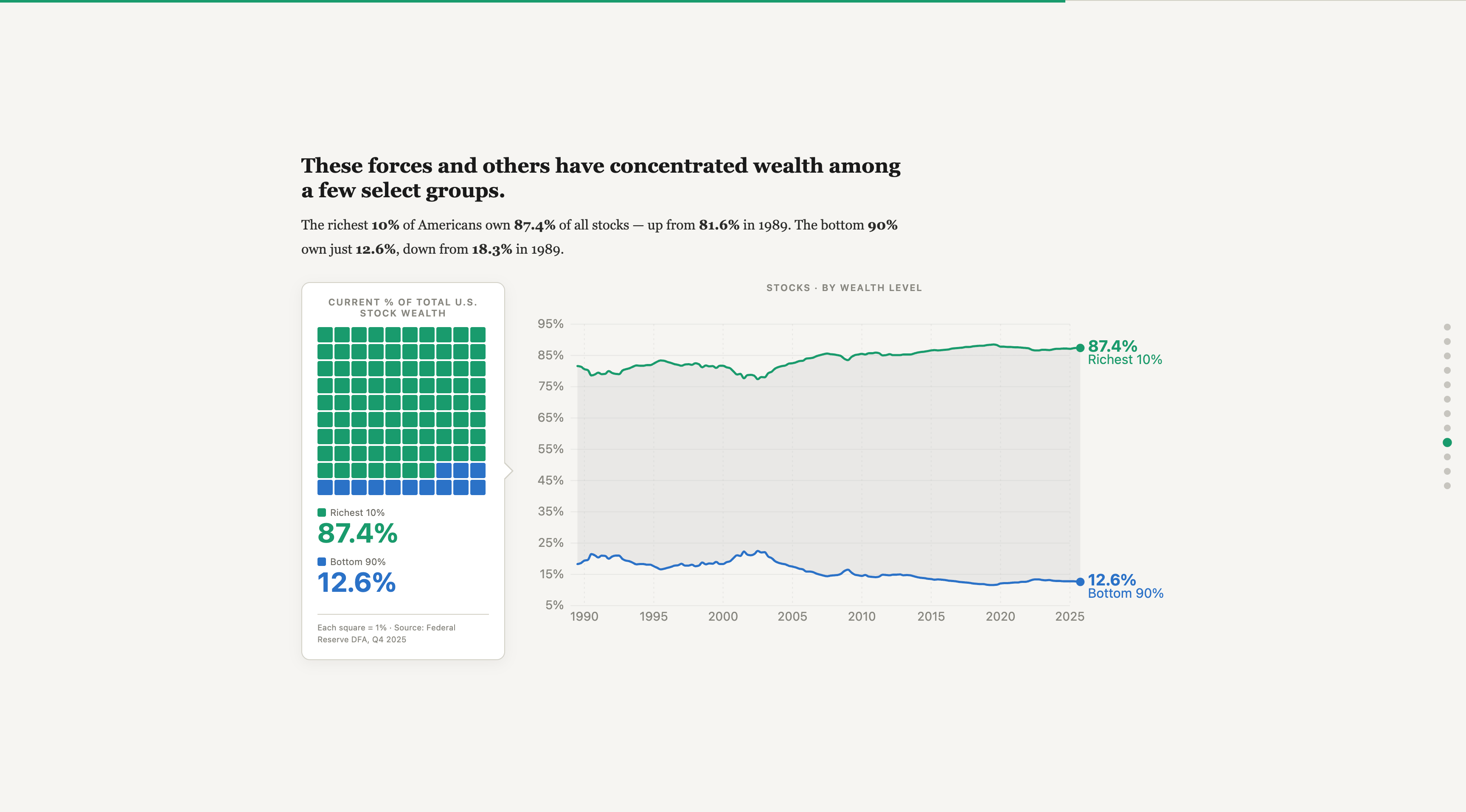
Second, the waffle charts. When I was looking for ways to differentiate the first bank of wealth-level overview charts from what came after, Claude suggested a waffle grid — 100 squares, each representing one percent of the relevant asset class, colored by who owns it. The richest 10% own 87.4% of all stocks. That’s 87 green squares and 13 blue ones. The format made it into the sketch immediately and stayed. Some ideas are right on first contact.
The build
The first unglamorous thing: I had to figure out a development workflow using Terminal and Python to run the build scripts, previewing locally via a virtual server. That infrastructure work — the part that happens before anything looks like anything — took real time to sort out. Once we’d worked out enough bugs to show Rick, we staged it on my interactive viz site via GitHub.
The stack is D3.js, Scrollama, and Svelte. Here’s what each one was actually for:
D3 handles all the chart rendering — the line charts, the waffle grids, axes, transitions, annotations. It’s doing the visual heavy lifting throughout.
Scrollama is the scroll-detection layer. You define a set of step elements; Scrollama fires events as they cross a threshold in the viewport. No scroll listeners, no manual position calculations. It’s the right tool for this kind of work and it’s genuinely pleasant to use.
Svelte is where I’ll be honest: I don’t fully understand the architecture and file structure of the Svelte packaging. What I can tell you is that there’s a main page and then all the different charts and visual elements — including the opener and the icon SVGs — live as components that were largely built and updated through AI collaboration. The mental model of components and reactive state is clean. Getting there wasn’t always.
The two real time sinks were responsive sizing and scroll-triggered state management. Getting the scale and dimensions to negotiate properly between desktop and mobile took a lot longer than expected. And working out all the scroll-triggered chart states — when each annotation fires, when each transition lands — was painstaking in a way that’s hard to shortcut.
The lesson I didn’t expect
Here’s the teachable moment I’m keeping for next time.
Rick only noticed once the interactive was actually shared with him that the stock and real estate charts needed their own sequential annotation callouts. He had provided those annotations for the first wealth overview chart — the sticky one — but the downstream asset charts had been built without that same treatment.
That’s on me. The question I should have asked much earlier in the process: we’re annotating this chart up top with multiple callouts that reveal on scroll — shouldn’t we do that for these charts too? Instead it surfaced late, and fixing it late meant going back into the scroll-triggered state logic after the responsive sizing work was already done. That’s the expensive kind of revision.
The broader lesson: a lot of the back-and-forth in the final stretch of this build came from not having the annotation logic and the responsive scale specs fully worked out at the sketch stage. Next time, that spec gets written before the first component gets built.
The finished piece
I feel really pleased with how clean and responsive the whole thing looks and feels. Rick’s writing is sharp — the framing he brings to the economic story is a big part of what makes the piece work. And I think the sequence and layout genuinely serve the story the data is telling.
What the scrolly format did was take what was already strong in those initial static charts we built for his column and use the format to go deeper — more asset classes, more demographic cuts, more time to let each finding breathe. The Flourish charts showed one dimension. The scrolly shows the whole thing.
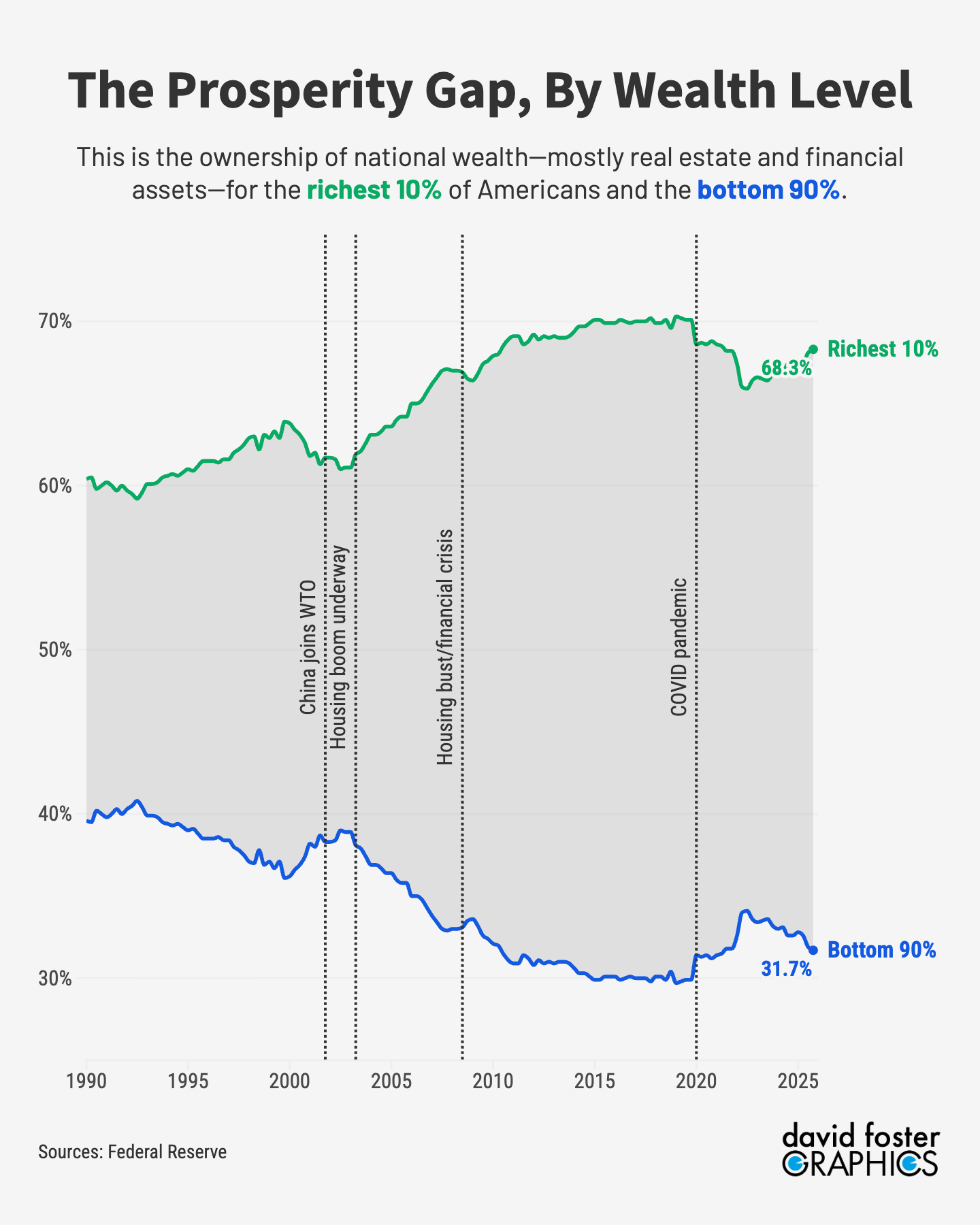
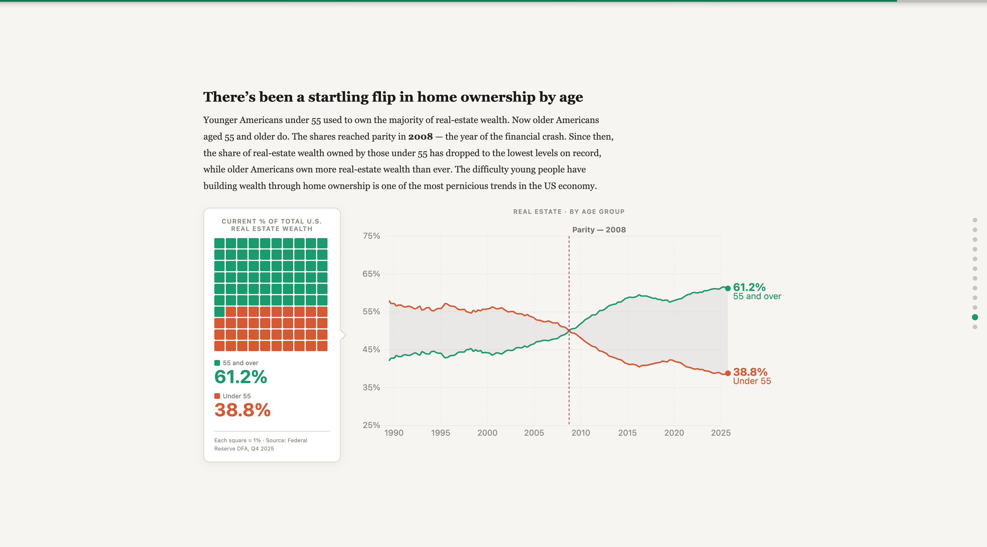
And the findings are worth sitting with. The wealthiest and oldest Americans have captured a growing share of both stock and housing wealth over the last 40 years. While a majority of Americans own stocks in some form — mostly through retirement accounts — the wealthiest 10% own 87% of all stocks. The trend is similar for real estate. Perhaps most striking: Americans under 55 used to own a majority of real estate wealth. Now Americans over 55 do. That’s a generational flip that happened within a single data series.
That last point is Rick’s framing, and it’s the right one: these findings help explain why so many Americans feel financially squeezed even when the economy looks healthy in the aggregate. The scrolly format gives that argument room to build — panel by panel, asset class by asset class — in a way two static charts never could.
The finished piece is on my website. Rick wrote two follow-up columns for The Pinpoint Press — one on changes in housing wealth and another on changes in stock wealth. All data is Federal Reserve Distributional Financial Accounts, Q4 2025.
Data: Federal Reserve · Visualization: David Foster Graphics
Love reading these Behind The Scenes narratives even when I was there behind the scenes! Nice work DF. Great visuals as always.